
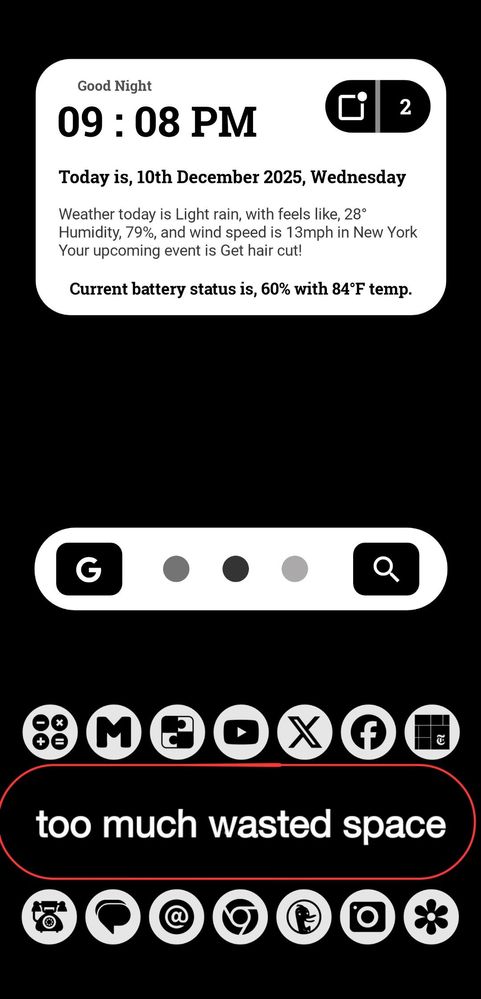
There is too much wasted space between favorites and page indicators area. We can have one one more vertical grid line if it gets shrunk. When you turn off the favorites dock there is also too much wasted space. I don't use the dock, I have it turned off in HomeUp. I don't need the same row of apps on each of my 3 screens.
No replies and comments found