
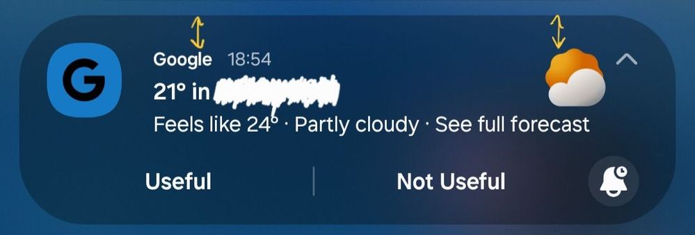
I just noticed the space between the notification text and border has shrunk in this One UI 8 Beta 2. I think it's too small.
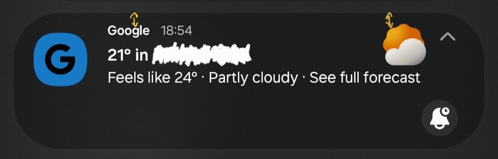
One UI 8 Beta 2
I think it looked better on Beta 1 or One UI 7
One UI 7
Edit: I mean I don't actually mind the small gap, but, in my opinion, it just feels a bit clunky at the top left. Maybe it needs some adjustments for the icons and/or spacing between "app name" and "notification text".
No replies and comments found