
Call me nitpicky but this is ridiculous. I can see three different styles for how color palette is applied to the same functionality in three different places. Bluetooth is an example. Look at the color of buds icon, subheader text, and "done" text. Please Samsung make it consistent.
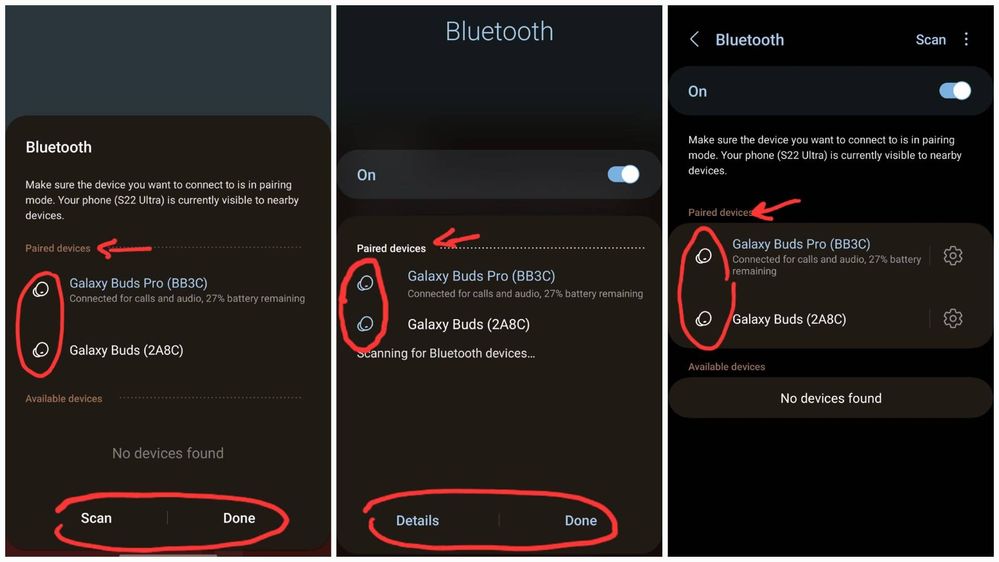
Left: pop up window
Middle: quick settings panel
Right: settings
Middle: quick settings panel
Right: settings
No replies and comments found