
Ir's already frustrating when Dex switched to using google's second screen method, but now it's a cosmetic change that's more annoying.
Now you have the bottom status bar (Finder, apps) AND a top that has the time, date AND everything that was in the bottom right corner previously. So now instead of just looking at the bottom of the screen for most things, you now have 3 corders and the bottom center, And of course, you can't screenshot to show off the issue :(
Also, you can't go exclusive fullscreen, outside of videos and games, but even it doesn't always work correctly.
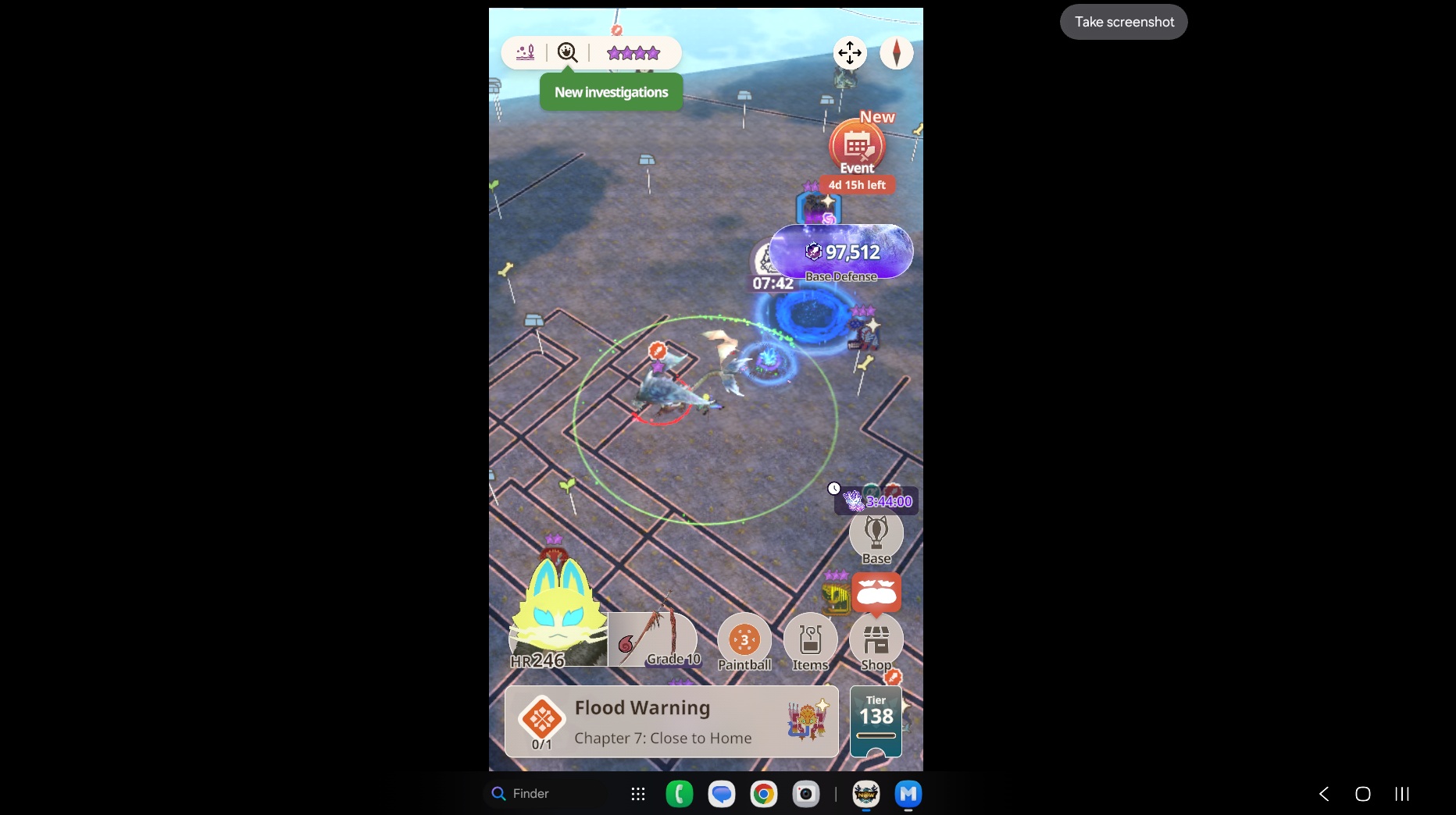
Example: I play Monster Hunter Go using an external, touchsceen monitor. Before, maximized or full screen, the game scaled properly. Now if not opened fullscreen, I get a hideous white top border.
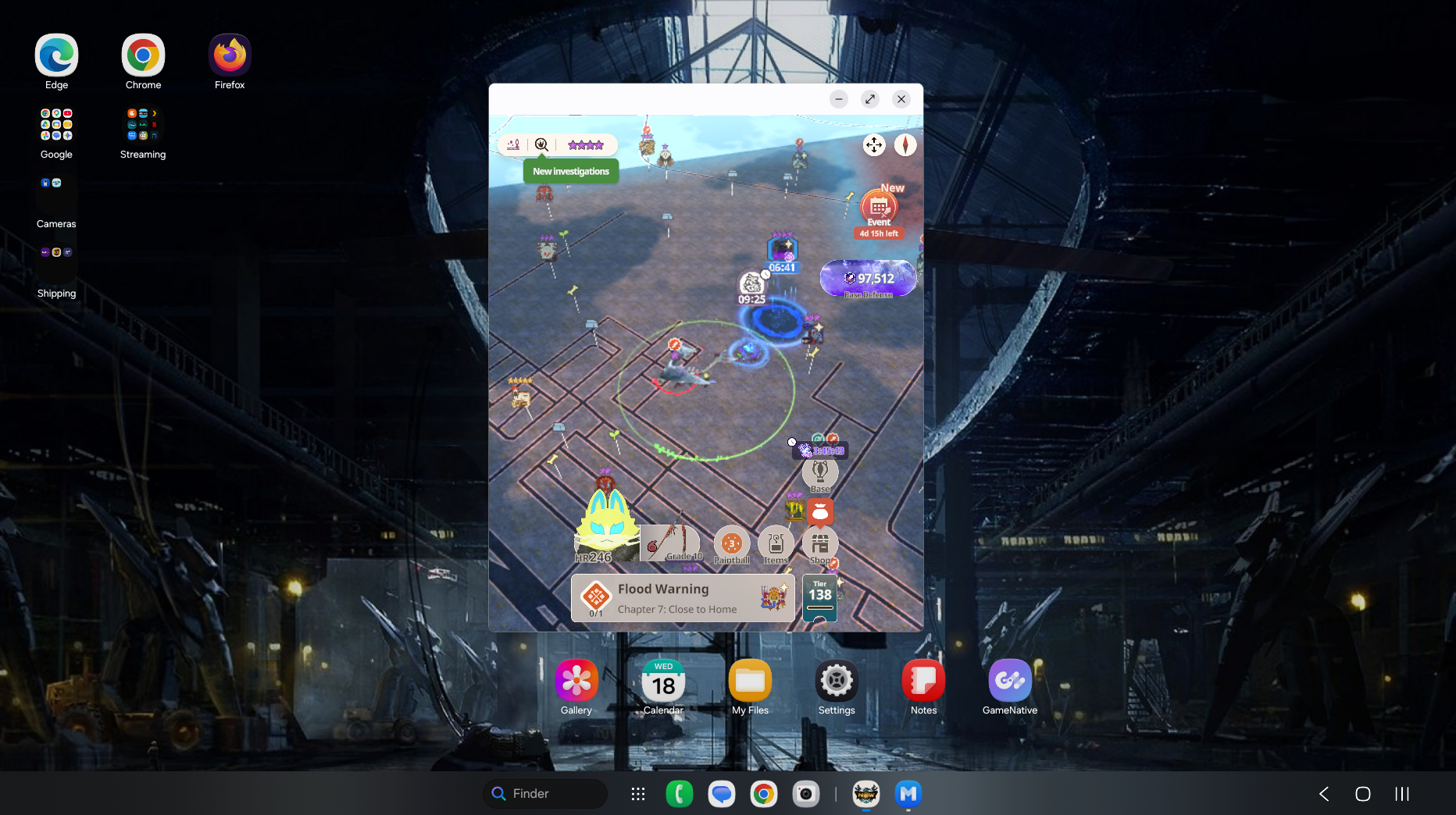
and if I go fullscreen, the game reverts to portrait mode.
Now you have the bottom status bar (Finder, apps) AND a top that has the time, date AND everything that was in the bottom right corner previously. So now instead of just looking at the bottom of the screen for most things, you now have 3 corders and the bottom center, And of course, you can't screenshot to show off the issue :(
Also, you can't go exclusive fullscreen, outside of videos and games, but even it doesn't always work correctly.
Example: I play Monster Hunter Go using an external, touchsceen monitor. Before, maximized or full screen, the game scaled properly. Now if not opened fullscreen, I get a hideous white top border.
This was bever an issue previously with any version of Dex. Already off to a bad start of design choices
No replies and comments found